From $72k to $1.9 Million: A Website Copywriting Case Study
September 29, 2021
I’ve never been so excited to share a website copywriting case study before.
I’m in a “pinch me so I know it’s real” mode after hearing news of just how impactful this website copywriting project has been for my eCommerce copywriting client, Bonnie of Archer & Olive.
Before Bonnie’s new website launched, she was averaging around $6,000 per month with her bullet journal-style dot grid journals and sketchbooks brand (that are amazing, by the way).
After working together, her conversion-ready website helped her drive over $300,000 in revenue from October 2018 to December 2018. (That’s in only one quarter, friends!)
Those are some incredible results all on their own, but do you know what’s even better?
Archer & Olive generated $1.9 million in revenue just ONE year after working together!
With a website copywriting investment around $4,400 (not including custom add-ons and product descriptions we’ve worked on since then as her business grows), it’s safe to say this project has been a wild success based on her ROI.
So how did we do it?!
I’m excited to share a deeper look into the strategic decisions we made during the website copywriting project and how her website was intentionally built for this level of growth. Let’s dig in!
(Ready to start your own website copywriting project? Let’s work together!)
The Story of our Website Copywriting Project
When Bonnie first contacted me in July 2018, I was fully booked with other projects during her desired start date. Even though her website design deadline was already set, we both knew we wanted to work together to create something epic.
After adding a little wiggle room to my calendar, I found a way to make it work. And boy, am I glad I did! It’s turned into one of my most enjoyable and profitable projects to date.
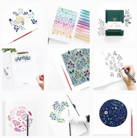
At the time, Bonnie decided to outsource her copywriting because she was struggling to keep up with her growth on Instagram (seriously, look how cute her feed is!!) while juggling all of the other hats of running her business. Who else can relate? *raises hand*
Creating a more optimized website was at the top of her to-do list as she set goals for the second half of the year. After hiring the incredible design team at Go Live HQ (and later taking the design in-house while working with The Owls on UX design improvements), she enlisted my help with all things website strategy and copywriting.
There were a few areas on her old website that we immediately wanted to improve:
- The call-to-actions were somewhat hidden and unassuming on her old website, which didn’t inspire people to explore her site.
- She wanted to increase her conversion rate from 1.3% to around 3% (which she has demolished since then!).
- Her biggest product differentiators weren’t highlighted on her Home and Shop pages.
- Her product descriptions didn’t include all of the benefits and features of her unique product.
From there, we talked about bringing her bright spirit and infectious energy into the copy by infusing the beautiful, community-oriented brand personality she’s well-known for on Instagram. Then we geared up for the first steps of my signature website copywriting process.
__________
Bonnie’s Brand Voice
motivational / fun / organized / feminine / inspiring / warm / friendly
__________
Website copywriting case study: Behind the strategy
Before I write a word of copy, I always collect information about my client’s brand foundation (things like their mission statement, core values, and things of that nature), website goals, and brand voice (things like words they love and don’t love).
From there, I translate all of that information into a custom conversion-ready website strategy that fits their business goals. This is primarily done by creating a visual layout of how the content will be displayed once the website design is created. I LOVE when clients give me full creative freedom to create something unique to them.
By using these layouts (which I call “copy wireframes”), I can show my clients all of the strategic decisions that go into each page. After their small revisions, I get to work on creating the actual copy while knowing that we’re both on the same page. (Not meant to be a copywriting pun… oops!)
Here are some of the winning features of each page we created for Archer & Olive.
Home page
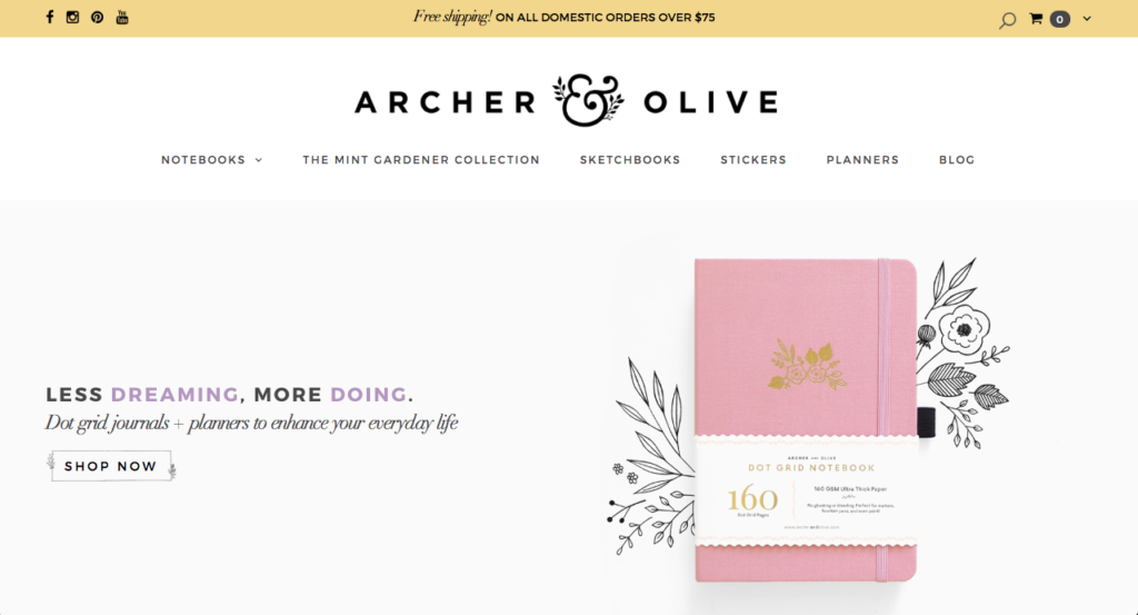
After playing around with a few different headline options from the Home page, we settled on “Less Dreaming. More Doing.” We originally tossed around the idea of having the words change so that the headline would show different variations of “Less ___, More ___”, but we decided that keeping it simple would do the trick.
The “Shop Now” call-to-action is much better than her previous website because you can tell it’s a button. Not only that, but it also includes her signature foliage sketches and design, making it stand out even more.
Knowing that Bonnie wanted to be known for the dot grid journals with the ability to branch out into other related products in the future, we found a way to highlight her signature product above-the-fold (meaning before you have to scroll on the Home page) while giving her room for additional products.
A year after our project, she has added more sketchbooks, planners, and other paper goods to her shop that give her audience a variety of options to choose from without becoming overwhelming.
We also simplified her website navigation to make the search process much easier.
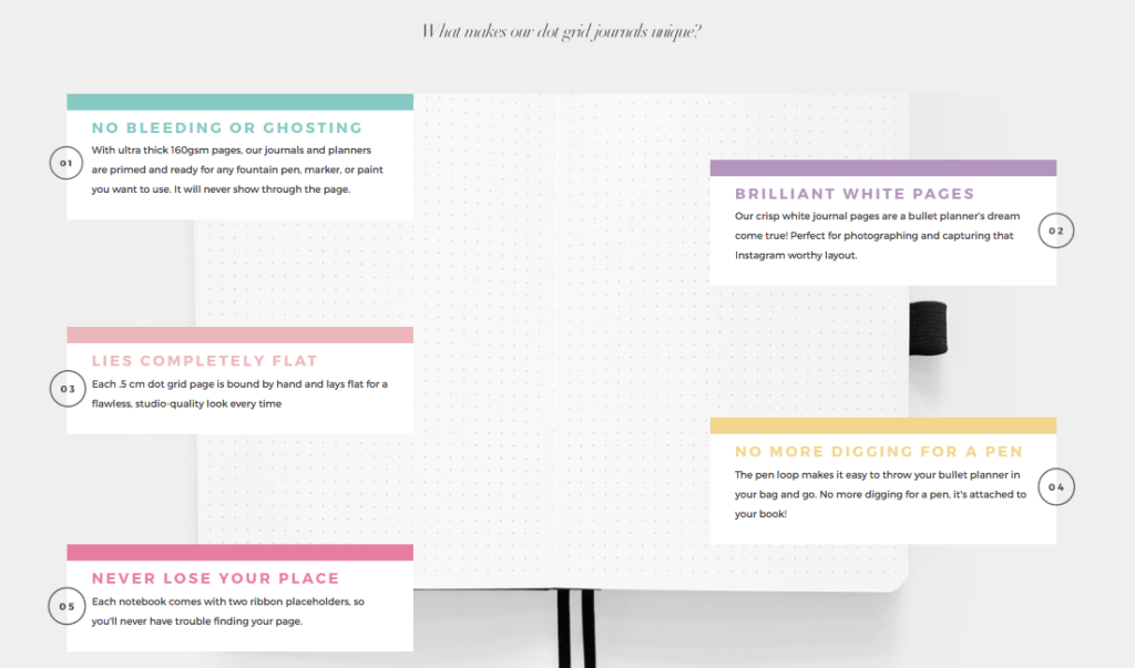
One of my favorite features of the Home page is this breakdown of exactly why Archer & Olive’s products stand out. Instead of putting the features and benefits into a typical list format, we decided to create a layout that was visually stunning, easy to skim as you scroll through it, and packed with additional information for visitors who wanted to learn more.
We also included these same differentiators in the Product landing pages on the right-hand side to remind visitors of why they should purchase from Archer & Olive.
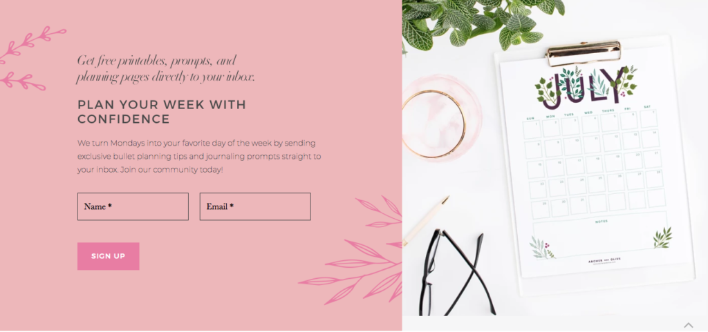
Another Home page feature that packs a punch is her email sign up form. We strategically put it toward the bottom of her Home page to ensure it didn’t distract from the main call-to-action of exploring her shop, but it also has been a great way to build her email list.
The header copy that says “Plan your week with confidence” speaks to her audience’s strongest desire when using their dot grid journals or planners. We also had some fun with the sentence “We turn Mondays into your favorite day of the week…” to approach the topic with a casual, fun flair. The brand voice matches the beautiful and playful designs you see here.
PS: Since the launch of Archer & Olive’s website, Bonnie made a small change to the Home page headline in 2020 to highlight the eco-friendliness of her products and the social responsibility of her new packaging. As such, she’s made a few tweaks to the design as well, but the vast majority of her copy has stayed the same. This shows how you can slightly update your design and messaging over time while keeping the foundations intact.
About page
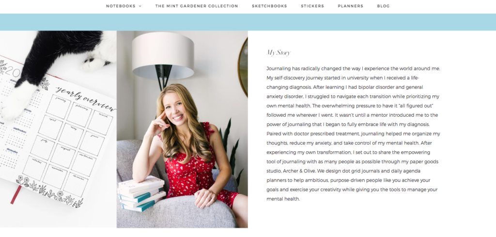
One of the main reasons I decided to make room on my calendar for this project was because of Bonnie’s personal story. On her previous website, there was no mention of the true motivation behind her starting Archer & Olive. Once I heard it in her own words, I knew I wanted to play a part in helping it come to life through ghostwriting.
If this is the first time you’ve heard the term “ghostwriting,” it refers to the act of writing in someone else’s voice and publishing it as if it was written by that person. This describes most of the work I do as a behind-the-scenes copywriter, and I loved putting it into action by telling Bonnie’s story from her perspective.
The main focus of her story was to explain how journaling has made a tremendous impact on her self-discovery and mental health journey, especially in helping her manage a bipolar disorder and general anxiety disorder diagnosis. Summarizing a huge chapter in someone’s life and condensing it down to a small paragraph isn’t easy, but it’s the kind of challenge I really love. We both were so happy with the final product!
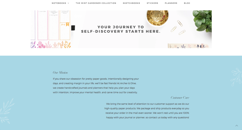
But before we launched into her personal story on the About page, we chose the headline “Your journey to self-discovery starts here” to inspire her audience and entice them to continue reading. Since Bonnie sees journaling as a self-discovery tool, it allowed us to put the focus back on what really matters.
We also added a “Customer Care” and “Our Mission” section to address her audience directly, letting them know they’re in the right place and promising they will receive the same quality service they put behind their quality products. At the very end of the page, you’ll see what I call “summary blocks” that include three different page options so people who are browsing through her About page can find what they need.
The Future of Archer & Olive
Since our website copywriting project, Bonnie has not only seen explosive growth in her revenue and pageviews, but she’s also been able to confidently launch new limited edition products and artist collaborations.
I’ve been lucky enough to collaborate with her on creating copy for many of these launches, writing everything from poetry-inspired Instagram captions (like this and this) to email newsletters to new product descriptions.
So, when I say I love being a long-term strategic partner for my clients, I clearly mean it. *wink*
Thank you so much for reading this in-depth website copywriting case study! There are so many more stories I could share from this incredible project that’s continuing to evolve, but let’s shift the attention to you for a moment.
If you have been:
- putting your website copy on the back burner
- struggling to sound anything like yourself
- focusing on the design rather than your messaging
… let’s chat!
I take on a selective amount of custom website copywriting projects each quarter so I can give clients my full attention. You can start by learning about my services or telling me more about your project.


