Making the Best First Impression with Your Website
October 5, 2015
Have you ever wondered what your readers are thinking about when they first visit your website?
Does your design make an impact?
Is your copy resonating with them?
How do you know if you’re making a good first impression?
Devan Danielle and I decided to take first impressions one step further after recently co-hosting a #createlounge chat together and offer blog reviews for participants. Rather than focusing on critiques, we set out to share feedback based on our first impression of the person’s website while spreading love in the process.
Naturally, we called it #BrandLoveFest.
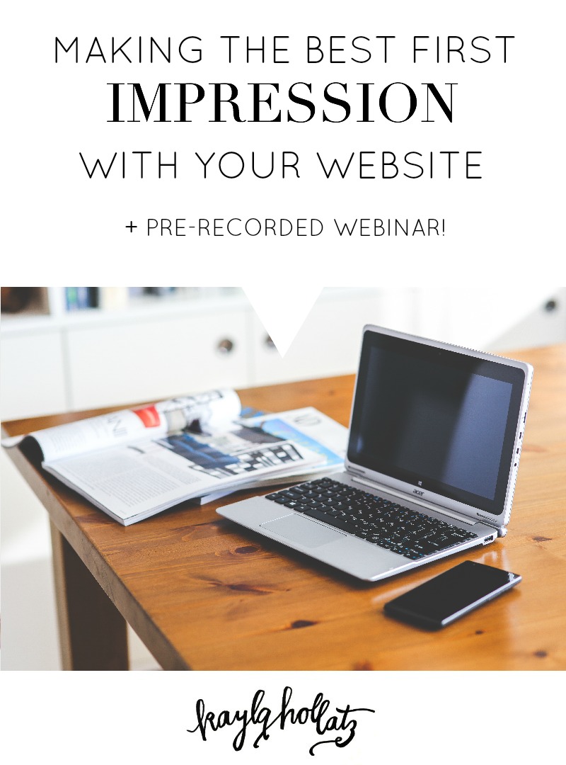
We recently taped our #BrandLoveFest webinar and spent around 5 minutes on each submitted website, detailing what our first impressions were, which elements we loved most, and additional areas for optimization.
Here are some of the major takeaways from the pre-recorded webinar:
Make an impact with your tagline
The most common thing Devan and I touched on while reviewing was the importance of a tagline that clearly states what you do and what audience you do it for. While catchy titles like “The Brand Stylist” can be fun, they are often vague and don’t tell your brand story.
Try a simple statement like “I help [audience here] do [what you help them with] through [what your product or services are].” Boom! You’ve got your tagline.
Keep consistent color palettes
Signature colors are a great way to be consistent with your color palette. Mine is a seafoam hue and I use it in all of my branding. Clean, simple, and most importantly, consistent.
Purple seemed to be a popular signature color from the websites we reviewed. Olivia Adams did a great job with her purple pop of color in her branded images and website borders, as well as Fran of Freeborboleta‘s purple opt-in border and the confetti in her homepage image above the fold.
If you want to include more than one color in your palette, stick to 2-3 colors. Caitlin Powell does this well with her choices of pink, yellow, and teal.
Have a headshot that shows personality
When I visit your blog, I want to see not just any photo of you, but one that shows your personality. Whether that’s you laughing, making a funny face, striking a signature pose, or just smiling warmly, I want to see you in your element. Colleen from Keep It Real Clean‘s sidebar photo instantly lets me know who I am connecting with when I read her blog.
Customize your opt-in button copy
Say it with me: I am more creative than the default “submit” button. It’s best to customize your copy to fit your mailing list offer. Marianne of Design Your Own Blog has great opt-in button copy saying “Oh Yeah!” which fits the rest of her upbeat copy well. It gets potential subscribers pumped up for her newsletter, creating a lasting, memorable impression.
Check out the full recording of #BrandLoveFest below:
